Adding colour by hand it was felt brought photos ‘to life’ though often as not the overall effect was often far from naturalistic or realistic and gave many pictures a somewhat other worldly quality. An analogy can be dawn with the clever handiwork performed in many an American funeral parlour whereby a sallow corpse is turned into a presenatable body an idealised frozen represntation to be viewed by the grieving relatives. In the case of the hand coloured photograph the tiny death (La petite mort) of the back and white image is replaced by a lifeless yet preserved colour image; set apart from the moment fixed (moment fixe).
This blog is where works in progress by Philip Sanderson are posted along with thoughts on the moving image, sound, photography and anything else. Scroll down for an index of previous posts.
Saturday, July 09, 2011
Wednesday, July 06, 2011
Patinas of the Past
..arguably the boundaries between past and present are blurred such that there is an ongoing dialogue between the two. One might even imagine that the library and soundtrack music of the 1970s which so inspires the bands labelled as hauntological may not have been recorded in the past at all but could have been recorded now or indeed in the future and have simply seeped through the fluid pores of non linear temporality to physically manifest itself as piece of vinyl in the 1970s or as a download now or as who knows what at some future date.
Ah if only…..
‘Holding a battered copy of the Ziggy Stardust LP in one's hands, it can seem like a repository for nostalgic residues, as if the grooves in the vinyl were in some way the sculptured marks of time¹s passing. Rather than let the sediments settle, the idea behind Suicide Suite was to create a means of once again setting in motion the sounds and images that have lain dormant since 1972. Suicide Suite dose not aim to remix or add to the original but rather to create a ghostly twin; an echo of the LP that occupies a parallel but somewhat warped trajectory.‘
Through a Telephone Box Darkly
Ah if only…..
‘Holding a battered copy of the Ziggy Stardust LP in one's hands, it can seem like a repository for nostalgic residues, as if the grooves in the vinyl were in some way the sculptured marks of time¹s passing. Rather than let the sediments settle, the idea behind Suicide Suite was to create a means of once again setting in motion the sounds and images that have lain dormant since 1972. Suicide Suite dose not aim to remix or add to the original but rather to create a ghostly twin; an echo of the LP that occupies a parallel but somewhat warped trajectory.‘
Through a Telephone Box Darkly
Sunday, July 03, 2011
Library Sale
As part of the American Ground festival in Hastings the library had a sale on - you know the sort - the ones in which they get rid of lots of interesting books to make way for popular autobiographies. Anyway I'm not complaining as I picked up some rather fine titles at 40P each. It occurred to me that if in a year's time you were strapped for cash and could not afford the new £9,000 university fees you could do worse than read these titles from cover to cover (total cost £3.20). Mind you my education was a little like that...
Wednesday, June 29, 2011
Secret Scuplture
In the 1960s and 1970s you might be forgiven for thinking that there wasn't much sculpture on TV - in fact there was a significant amount of subliminal sculpture by anonymous artists used as a backdrop behind bands and singers as they performed on TV shows. Echoing the contemporary sculptural forms of the day these often bold and yet unassuming works (they were never mentioned or acknowledged) have never been catalogued and are all but forgotten. Many no doubt had a short life span and some were probably destroyed after the performances in which they were used. Youtube (as ever) gives us an opportunity to revisit these works. Here are a couple of stills and an edited Barry Ryan video in which a rotating wire construction take up roughly a third of the on screen time.
Sunday, June 26, 2011
Touch and Play
Passing by the modernist toy shop of Paul & Marjorie Abbatt (2Bs and 2Ts) at 94 Wimpole Street I noticed Goldfinger carefully cutting out wooden letters, his Savile Row suit protected by a jute apron on which the small splinters of wood landed before being brushed towards the floor.
Stepping inside the toy shop to take a closer look at the merchandise I was approached by a nice lady in a blue cardigan who said ‘you may touch and play’. Goldfinger nodded and smiled adding ‘toys should be functional in design and educational in purpose”. I sensed though his mind was elsewhere, no doubt contemplating his big new commission at the Elephant & Castle.
Saturday, June 25, 2011
Modularity for Modern Living
The flexibility of the living space is derived from its modular construction in which numerous adjacent square and rectilinear sections can either be used independently as individual zones or combined together to form larger units as required.
Thursday, June 23, 2011
Fewer frames make finer films - Contracted Cinema
Contracted Cinema – the reverse or, better still the inverse of expanded cinema.
In terms of defining that which we seek to invert namely expanded cinema, we could choose Gene Youngblood’s interpretation – a fluid liquid a go-go of art and life colliding as retinal consciousness which, for years had all the appeal of some bad hippy trip but now, in the age of media convergence seems timely and prescient. Alternatively we might prefer the English somewhat more sober focus on expanded cinema as involving the transformation of the spectator’s reception of the cinematic.
So contracted cinema then is the opposite of all that? In trying to achieve contraction we might try simple physical ploys like ensuring that all seats have a restricted view with pillars and obstacles between them and the screen or indeed we could take out the seats and make the audience stand to attention or slump against the wall. We might ensure that the sound is all but inaudible so audiences strain to hear over the amplifier hum or indeed we could crank up the volume sending the punters from the auditorium with ears bleeding. In terms of timing the contracted cinema programme should always begin before the audience arrives and end before they leave. But you protest, this is all too familiar, this is nothing new, your contracted cinema is what we already experience when we visit artist projections in the gallery; the black box in the white cube.
Bother - we need something less simplistic than just making life difficult for the audience or spectator. So contracted cinema could mean just less of everything; a sort of rationed cinema. Our slogan could be ‘Fewer frames make finer films’. To be fair though film stock was always so damned expensive that an excess of celluloid was rarely a problem it was video that could and often did go on and on. ”Cut out the bits you don’t need”. Sounds like a recipe for lo-fi. Should we be considering the material nature of the medium and how to foreground this, reducing everything down to the bare essence. Hell why not dispense with the whole paraphernalia (if we set light to it, it could be parafinalia) and just look out the window?
In terms of defining that which we seek to invert namely expanded cinema, we could choose Gene Youngblood’s interpretation – a fluid liquid a go-go of art and life colliding as retinal consciousness which, for years had all the appeal of some bad hippy trip but now, in the age of media convergence seems timely and prescient. Alternatively we might prefer the English somewhat more sober focus on expanded cinema as involving the transformation of the spectator’s reception of the cinematic.
So contracted cinema then is the opposite of all that? In trying to achieve contraction we might try simple physical ploys like ensuring that all seats have a restricted view with pillars and obstacles between them and the screen or indeed we could take out the seats and make the audience stand to attention or slump against the wall. We might ensure that the sound is all but inaudible so audiences strain to hear over the amplifier hum or indeed we could crank up the volume sending the punters from the auditorium with ears bleeding. In terms of timing the contracted cinema programme should always begin before the audience arrives and end before they leave. But you protest, this is all too familiar, this is nothing new, your contracted cinema is what we already experience when we visit artist projections in the gallery; the black box in the white cube.
Bother - we need something less simplistic than just making life difficult for the audience or spectator. So contracted cinema could mean just less of everything; a sort of rationed cinema. Our slogan could be ‘Fewer frames make finer films’. To be fair though film stock was always so damned expensive that an excess of celluloid was rarely a problem it was video that could and often did go on and on. ”Cut out the bits you don’t need”. Sounds like a recipe for lo-fi. Should we be considering the material nature of the medium and how to foreground this, reducing everything down to the bare essence. Hell why not dispense with the whole paraphernalia (if we set light to it, it could be parafinalia) and just look out the window?
Tuesday, June 21, 2011
English Vernacular
Whitstable doesn't have any grand buildings or architectural masterworks it does however have a lot of good old English Vernacular as per this example. For no particular reason I had a go at sketching the building which was slightly tricky as it was raining and I was standing up holding the pad in one hand and attempting to draw with the other - oh and I hadn't done any sketching for quite a few years. Excuses aside it did demonstrate almost straight away how much more of a building you 'see' when you draw it rather than photograph it if only as you repeat the action of looking back and forth from the building to the paper having for a split second to memorise what you have just seen and then reproduce or interpret it. Clearly I will be signing up for the summer water colour and drawing school.
Monday, June 20, 2011
Spotting and Foxing
1st edition, hardback with inscription on frontispiece. The pages are clean and bright although slightly yellowed. The cover is a little grubby with some staining. The corners and spine are bumped and worn. The spine is split in the middle and repaired. Damage from what looks like sellotape. The dust jacket is clipped with tiny closed tear to rear, slight bumping to illustrated boards, some spotting and foxing to endpapers and closed page. Ex library stock has a number of stamps throughout the book mainly on the back of the colour plates. Numbers written on first endpage, light shelf wear, showing signs of rubbing and marks, but still pretty neat. Early pages have a few pencil notes, though generally book is clean and very readable. A used second-hand book. Condition: Fair.
Friday, June 17, 2011
High Street
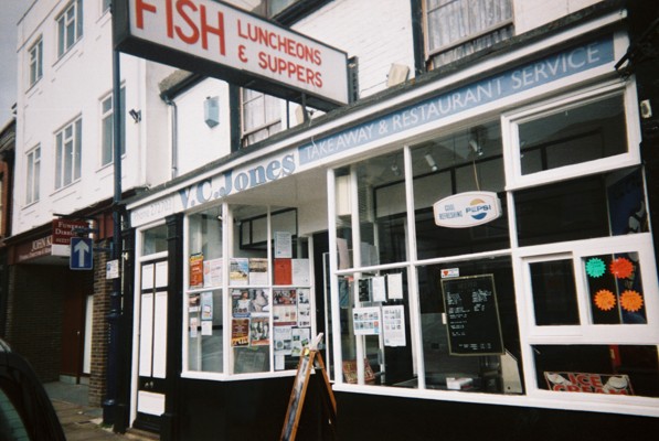
Spent a few days last week down in Whitstable. It had been some ten years or so since I was last there and though undoubtedly a little more touristy it still manages to avoid being like a novelty model village. The high street has working fishmongers, butchers, bakers, greengrocers, hardware shops etc all run independently, just as you used to find on any high street before the advent of the supermarket and which, you still find in most of mainland Europe (though yes I have heard the reports of Boulangeries closing at an alarming rate). It is not so much that one should be nostalgic for such times or romantic notions of ‘community’ but a working high street (and I would contrast this with the boutique foody artifice of Borough Market) just makes the quality of life so much better.
Thursday, September 30, 2010
Make Art History
As the Make Poverty History campaign falters and with the prospect of 25-40% cuts in the arts it seems far more likely that we can Make Art History
Thursday, September 23, 2010
Battle of the Pixels
Sunday, August 29, 2010
Sunday, May 16, 2010
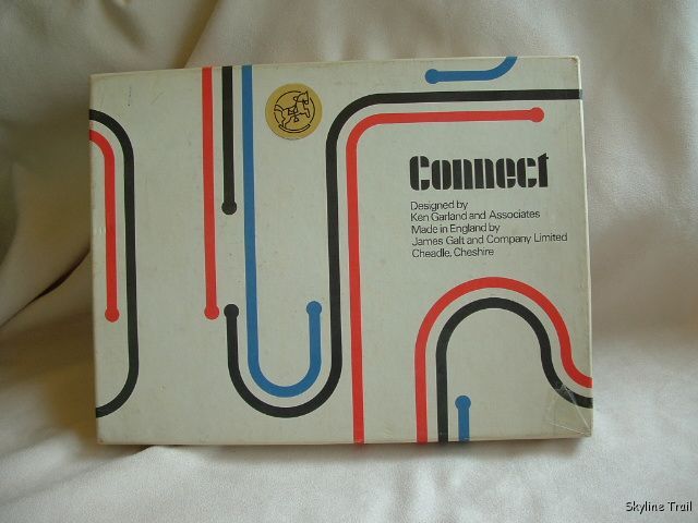
Connect by Ken Garland for Galt
Go down the aisle of a Toys R Us shop today and your senses are assaulted by sequences of brightly coloured and somewhat garish plastic toys all competing for your attention. Many have a quirky charm displaying something of a mutoid imagination at work but few would be seen as works of modern design. Yet for a period in the 60s two of Britain's leading toy makers Galt and Abbatt produced games, puzzles and jigsaws, which in their own way are perfect examples of high modernism. The best of these modernist toys is Connect designed by Ken Garland for Galt in 1969. Garland and Associates is a firm of graphic designers and they were originally asked to redesign Galt packaging and brochures. This Garland did with aplomb using what by today’s standards would be considered very muted tones and fonts.


Having designed the packaging Garland and Associates moved on to designing the some of the Galt toys themselves bringing contemporary 1960s graphic design values to the toys and a particular emphasis upon spatialization, sequencing and repetition.
Connect best embodies this comprised of 140 cards each with red, blue and black lines the game involves linking up the cards in style that owes something to dominos to create extended patterns that look for all the world like some minimalist artwork by Sol Lewitt or even in some ways Mondrian.
The game was designed to be played on the floor and to weave around household furniture and other objects. With its stark simplicity a whole generation of children where unbeknownst to them engaging in an early course in graphic design principles.
The rights to Connect were later licensed by the German toymaker Ravensburger and renamed Rivers, Roads & Rails. Unfortunately whilst the game still employs the same underlying principle the simple colored lines have been replaced by representational drawings and so loose its graphic simplicity and abstract edge.
Thursday, February 18, 2010
A funny thing...
When I woke up this morning at 5AM these lines popped into me head...
I have know you and loved you so long that
I no longer know where I end and you begin
said the romantic poet to his wife of many a year
She smiled sweetly both at his presumption
and for a moment seeing herself in the arms of Clarice Duff
the landlord’s daughter
Subscribe to:
Posts (Atom)